Wednesday, March 7, 2012

My Favorites!


My favorite types of artwork this quarter was learning about Jan Van Eyck and his mysterious paintings. Not only were they mysterious but also they were so colorful and full of uniqueness. I loved that he painted such a beautiful picture and there is always such great detail, the painting never gets boring. Specifically, I really like that he put his signature or a quote in such small detail around his paintings. That to me really makes the audience connect with the painter. For example, in “Double portrait of Giovanni Arnolfini and His Wife” (1434), there is a mirror painted in the background and if you look carefully there are scenes of Christ all around the mirror. That to me is amazing and it’s so small, it makes me wonder how he painted such a detailed mirror with little room. Jan Van Eyck set the bar when it came to oil painting. He created new and fascinating ways to make his paintings stand out. He loved the way the light shined on his paintings and I think that’s really amazing and I can definitely relate to that as I am an artist too. I was definitely intrigued by this painting because of its visual details.
Another one of my favorite art pieces is Raphael’s “ The School of Athens” in “Stanza Della Segnatura” (1510-1511). I love how much detail is throughout this painting. The vanishing point in brings this painting together and then leads your eye to the surround background. It’s interesting that he chose to put Plato and Aristotle in the center. I think that Raphael is genius for putting philosophers and then a self-portrait himself in this painting. I really liked looking at this painting because there is so much meaning all around it. From the architecture to the various stages of understand, there is a sense of realness and I really enjoy it. I think I was mostly drawn to this painting because of its historical context because it has so much meaning behind it. If I were to glance at it and didn’t know anything about who was who and why it was there, I probably would think about this painting a totally different way.
Albrecht Durer also catches my eye. His painting, “Self-Portrait” (1500), was one of my favorite paintings to learn about this quarter. This painting is interesting both visually and historically. This self-portrait has incredible detail and the way the light hits his face and hair really makes the painting stand out. My favorite part about this painting is that it interprets Christ. I think Durer is also genius to “look through the eyes of Christ” in this painting, perhaps to get closer to his viewers, but it’s a unique way to show it. I like that such thing has never been done before and I really cherish that about Durer. He had a mind of his own and he embraced it. The quality of the hair in this picture is absolutely naturalistic and the fact that he changed his hair color to match Christ’s is brilliance! He also signed every one of his paintings and just like Van Eyck, it made them more recognizable. 

Wednesday, February 29, 2012

"Blue Boy" By Thomas Gainsborough


            Blue Boy by Thomas Gainsborough (c1748-1750) was an amazing painting in the 18th century. The oil painting was actually a previous painting but was painted over with the “blue boy”. What makes this piece so unique is that it is so different from a Renaissance oil painting. There is more focus on the full figure rather then what surrounds the figure. The background is purposely blurry which has never been seen before, which is an interesting painting technique. It’s interesting that Gainsborough decided to make the background blurry because he’s actually a landscape painter. Most of his work has landscape painted within them, along with formal suitable figures.
            Gainsborough had seen sent to London when he was 13 to pursue learning about landscape when he started learning of the French Rococo, which has a major influence on his paintings and the growth of his style. He was specifically known for painting and drawing such detailed landscape variety, it made him quite famous and well known for his love of landscapes. Other painters thought he was the most keen into spending so much time on just his landscapes. “Blue Boy” was supposed to be a completely different painting then it turned out to be, but it also turned out to be one of Gainsborough’s most well known paintings. It is said the Gainsborough painted the “Blue Boy” just to prove his rival, Joshua Reynolds and his philosophy on painting. His influences included Anthony Van Dyck and his wonderful dedicated lifestyle to painting new things. He liked to paint things that Van Dyck used in his paintings or were similar. The clothes that Van Dyck painted in his pictures had an influence on Gainsborough as well. He liked to paint people from all sorts of classes and it is common that most painters, including Allan Ramsay and Joshua Reynolds also were somewhat devoted to represent sitters in their paintings. 
            “Blue Boy” is unique in it’s own way. It is said that he painted such a character with these specific clothes because it was in a different century. The painting itself is very different then any Renaissance picture I’ve seen. The character is different, the background style is different and also the colors are very contrasting. My favorite part of this painting is that the “Blue Boy” seems sophisticated, like he’s waiting for something. The colors of his attire are completely opposite to the background and that’s very original for Gainsborough to do. I wish I knew why he decided to paint such a beautiful landscape, then all of the sudden paint over it with such a random subject, a boy in all blue. Other historians believe that his influence directly came from Van Dyck and Rococo. His love for landscape made him famous. Not only did he paint beautiful figures but with such a unique style of backgrounds.


"Thomas Gainsborough." . N.p., n.d. Web. 29 Feb 2012. <http://www.wga.hu/tours/english/frame4.html>.

The Blue Boy (c 1770). "Thomas Gainsborough." . N.p., n.d. Web. 29 Feb 2012. < http://huntington.org/thehuntington_full.aspx?id=982 >.

David A. Brenneman, . "Thomas Gainsborough and the "thin brilliant style of pencilling Van Dyck"." . N.p., n.d. Web. 29 Feb 2012.<http://www.jstor.org/pss/10.1525/hlq.2007.70.2.203?searchUrl=/action/doBasicSearch?Query=Thomas+Gainsborough&acc=off&wc=on&Search=yes>.


Wednesday, February 22, 2012

Baroque vs. Michelangelo


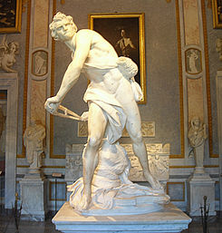
 Bernini’s “David”(1623) was a change of the 17th century compared to Michelangelo’s 16th century “David” (1501-1504). These two David’s, made in two different centuries were portrayed as the same man with completely different qualities. Bernini’s piece of art turned away from the classic Renaissance style and went for something completely different. As Michelangelo’s piece is stable, innocent, and mysterious, Bernini decided to go with a more mature David. Bernini’s David was depicted as lean, determined, tense, and his stance (which has never been seen before), shoes it. Baroque varies away from Renaissance art because it full of exaggerated motion and detail. Michelangelo’s David is transformed over after Bernini remade this incredible new altered sculpture.

     The first thing that makes these two sculptures unusual is the figures stances. Bernini’s twisted David was something that the people had never seen before. As Michelangelo’s piece is standing straight, it is very different to the crouched down 17th century David. Bernini’s David is exciting and full of action! The fact that this David is caught in conflict makes this sculpture more visually appealing. This sculpture has the viewer captured in the moment with David as he is in the middle of battle about to throw the stone, rather than the other David were the viewer is displaced and dispassionate.
As for the 17th century David, there are many different things that separate it from the traditional Renaissance David. As far as the stance, Renaissance sculptures were strictly all about frontal views, making the Michelangelo piece only dictating the observer to view it from one side to the other rather than an overall three-dimensional feel like Bernini’s idea. The facial expressions are both extremely different as well. As for Michelangelo’s piece, his face is still and doesn’t really show any emotion. Bernini’s piece shows David to be masculine, realistic, and full of emotion. He is ready for battle and it is easy for the view to tell he is in the moment of adrenaline. His facial expression is different than anything seen before it actually shows what a man would really look like in the middle of battle.
What I find most interesting about these two pieces is that one is nude and one is not. I may guess what Bernini’s piece is not nude because men do not battle naked. I think Bernini wanted people to focus more on what the sculpture is representing rather than the nude. It is also interesting because his sculpture is actually a self-portrait of himself. Maybe that is another reason why he put drapes over his nude body. What I noticed most about 16th century artists like Michelangelo is that they are perfectionists. They wanted every detail to be perfect. Artists like Bernini wanted his artwork to be realistic but not perfect. His David had amazing detail, but his piece shows more realistic emotion than Michelangelo’s piece. Bernini’s dramatically altered David changed the way of sculpture for the 17th century.


Wednesday, February 8, 2012

Albrecht Dürer


Albrecht Dürer (1471-1528) was one of the most interesting painters of all time. He’s known for doing self-portraits during the Renaissance, which made him highly famous. One of the most interesting paintings he’s done is the well-known painting, “Self-Portrait” (1500). It is said that this painting is interesting because his pose is recalling the appearances of Christ. He also did something very odd, he changed his natural hair color to make the painting more dramatic and look more like Christ. I’m not sure why he wanted to make himself look like Christ, but maybe he wanted to feel powerful and dominated, or maybe he just wanted to see Christ through himself. A lot of early painters painted Christ in their paintings, but never to actually “be like” Christ.
High Renaissance was more leaning towards naturalism and balance, but this triangular representation of himself depicts more on the lines of Northern Renaissance art forms. For example, his frontal view was more popular in the earlier Renaissance stages. Also, naturalism, the rise of humanism was a big part in the Early Renaissance and he definitely reflected that in his self-portrait. Another popular subject to do in these early phases, were self-portraits. A lot of painters during this time like to reflect themselves in their very own paintings. For example, Jan Van Eyck also liked to put part of himself in his paintings, whether it was a self-image or a scripture.
Most importantly, Albrecht Dürer had a mind of his own, or as people would say he was, “independent creative genius”. He was most famous for publishing woodcut prints in Germany, trade marking everything he’s ever painted, and painting himself in everything. His self-portrait made him very popular, considering it is extremely realistic. Another thing Dürer is famous for, was painting his chin hairs. You can tell in this painting that his chin hairs stand out. They seem like they are almost glowing! Considering Dürer travelled to Italy, I assume that the famous Michelangelo or Raphael influenced him, just like many other artists that travelled through Italy. In this “Self-Portrait” painting, it seems almost real, it is so detailed. From the curly locks on his head, to his fingertips are incredibly specified. It is interesting that this painting is very dark, yet his face and hand are highlighted, not like any Renaissance has seen. I think Dürer liked having his individual achievement and being able to do whatever he wanted, especially because he was from Germany, he started his own type of art. What I find most particular is the quality of the painting. The exact detail of this triangular perspective really is eye popping, just as Northern Renaissance paintings started to capture. The full depth in this painting really is a great representative of Albrecht Dürer and his amazing artistic abilities. I think he was most remembered for his experiments, nothing like anybody has ever seen, and his “Self-Portrait” is a good example of an outstanding picture and representative of a naturalistic piece.
         

Wednesday, February 1, 2012

Comparative Analysis


Pontormo’s Entombment created in c.1528 and Parmigianino’s Madonna with the Long Neck made in c.1535-1640 are both very similar in the Late Renaissance period. During these periods, a lot of paintings have changed over time. A new style of art has risen in the Late Renaissance called Mannerism. It has been known that the Late Renaissance went downhill after Mannerist paintings were made. They couldn’t compare to the High Renaissance because of the unusual naturalism. For example, Pontormo’s Entombment and Parmigianino’s Madonna with the Long Neck, both portray elements of the Mannerist paintings, such as clashing colors, elongated bodies, and strange themes. This was a major difference from the Early and High Renaissance period because these specific Mannerist paintings were far from any Michelangelo or Leonardo Di Vinci painting!
The Entombment painting is almost an awkward painting. the bodies are so elongated, it looks very unnatural. Madonna with the Long Neck also appears to have a very extended neck making her look unusual and abnormal. I’ve noticed in the Late Renaissance paintings have changed dramatically. Paintings are starting to become unnatural and the character’s emotions are changing as well. The specific detail in each painting is also lacking. The Entombment definitely fits in the Mannerist category because the people are placed in exotic poses, along with contorted bodies, and dramatic colors. The people’s faces are not very detailed, it’s almost like Pontormo wanted the audience to focus more on the bodies and the drama, rather than the specific details. Madonna with the Long Neck is also depicted this way. She is holding a child in her arms, but because the body is so long it looks like a much older boy. Her long limbs and fingers throw off the naturalism in this piece of art. The colors in this painting are not as drastic as the Entombment, but the details of the long bodies make these paintings very similar.
It’s interesting to see these paintings because they are so theatrical, especially because they both have the virgin in them. The Entombment has a sexual feel, not like most paintings that have the virgin in them. One major difference between these two, are the facial expressions. Madonna and the angels seem to be very astonished by the child and are intrigued, whereas the Entombment has a very sad feel, yet the bodies created in an extremely sensual way. Parmigianino’s painting seems a lot more formal than Pontormo’s painting. The colors are drastically different between the two and the Madonna is more believable than the Entombment in terms of “normal”. Even though Madonna has a very large neck and a large baby, the painting is more settled than the other. Both paintings have restrained naturalism and have unclear perspectives. Also, the Madonna painting is not proportioned; most of the activeness is represented on only the left side of the painting, with few details in the background. The Entombment is well more proportioned, yet it seems as if the characters in the background are floating.


Tuesday, January 24, 2012

Early Renaissance Vs. High Renaissance


·   


For my two pieces of artwork, I chose to talk about are the “Portrait of a Woman and Man (Angiola Di Bernardo Sapiti and Lorenzo Di Raniei Scholari) by Fra Filippo Lippo and  “Agnelo Doni” by the famous Raphael. I chose these paintings because they are extremely similar but very different styles at the same time. “Portrait of a Woman and Man” was painted in the Early Renaissance stage as for “Agnelo Doni” was painted in the High Renaissance stage.
One major similarity these two paintings have is that they both are portrayed to be newlywed portraits. Although, “Portrait of a Woman and Man” is considered a double-portrait, “Agnelo Doni” and his newlywed wife were painting on two separate canvases.  It is also interesting to me that in both paintings, the newlywed couples are not touching or showing any affectionate toward each other, considering Agnelo had his paintings with his wife completely separate.
    Fra Filppo Lippi’s Early Renaissance painting and Raphael’s High Renaissance painting are much different in many ways. Lippi’s painting is much more soft and elegant. The Painting has easygoing colors and a gentle touch. Raphael’s painting is more detailed with better illusion and depth. The woman in Fra Filippo Lippi’s painting is oversized and almost does not seem to fit into the frame. Her body is proportioned, but the frame does not seem to fit her correctly. Where as Agnelo is easily proportioned and centered in the frame. His arm leaning towards the back of the painting gives him that three-dimensional depth unlike the woman where she is standing to the side where only her profile is showing. I think Raphael was trying to address more the viewer rather then the scene, which Fra Filippo Lippi did in his earlier paintings.
    Various changings in both changes with these two portraits as well. “Agnleo Doni’s” facial expression is much more detailed then the woman’s in the other painting. I noticed more female faces in the Early Renaissance to reassemble people as looking porcelain, rather than realistic. Raphael’s painting is of a man, which seems to be a lot more detailed than the other two figures in the other painting. They both have no expression on their face so it’s hard to tell what kind of feeling this painting wants me to feel. Agnelo Doni looks serious but also casual. My eye’s are at ease, but I would have never guessed this to be a painting based off of a newly wedded man.
    As far as dynamic unity with these two paintings, Raphael’s piece shows variety in poses and gestures rather than Lippi’s pice. Both paintings are very “classical” and elegant but as the book says, “High Renaissance art is characterized by a sense of gravity and decorum, a complex but ordered relationship of individual parts to a whole” which focuses on the real and ideal characterizing scenes and portraits. I would say both paintings share certain characteristics, but the High Renaissance pieces show more dynamic unity as a whole.